🌅 Background
🏆 The Golden Middle Ground of Design Systems
We need a golden middle ground between skeuomorphism and a dearth of distinguishing signifiers for UI elements ~ Jakob Nielsen: Tablet Usability, on the dangers of Flat Design
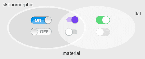
Google dropped the first public version of Material Design in 2014. Back then, design was trending away from the overembellished realism of Skeuomorphic Design toward the minimalistic school of Flat Design.
Material Design straddled the golden middle ground between the two schools by integrating the best parts of both:
- Like Flat Design, its coloring was bold, its typography clear, and every element had purpose
- Like Skeuomorphic Design, its components had depth, transitions were fun, and interations felt natural

At the center of its structure was the idea of "Quantum Paper", which was prototyped with physical lighting and actual paper. A short video, 'Making Material Design' (shown below), features a reenactment of the physical prototyping Jon Wiley, the principal designer, employed with his team. The video also features some back story on the origins of the design system.
When a colleague showed me Material Design back in 2014, there was much less context and information available. There were no videos, the specification was still rudimentary, and there were just a few crude open source tools implementing the system. Yet even this small taste of Material Design was enough to pique my interest.
♻️ Gone and Back Again
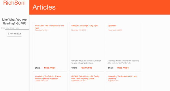
I played with Material Design on richsoni.com back in November 2014, just a few months after its release. The Web SDKs available at the time were still immature, so I basically stitched together some CSS snippets to build the initial version shown below.

I iterated over this design for about a year, but it was ultimately scrapped. Despite my affinity for the system, the immature tooling was too cumbersome to work with for this site's purposes. At the time, I wanted my focus to be on content and features, not fiddling with tooling and stylesheet overrides.
For the next four years (2016-2019), I mostly ignored Material Design, its competing design systems, general component libraries, and CSS frameworks. After ditching Material Design on richsoni.com, I opted to keep the site's design to a minimum — browser defaults, inline styles, sprinkled with a few bells and whistles (a nice navbar with animation). Even my work projects (both at Ticket Evolution and WeWork) abstained from open source design systems and components, mostly using bespoke stuff built in house. I simply had no need to follow the design trends.
In 2019 React Hooks exploded in popularity, and offered an easier way to 'resuse stateful logic between components'. This meant component libraries were much easier to integrate and use within an application. Many of these matured libraries offered a lot in terms of functionality — accessibility, flexible theming, robust APIs. Adopting one was well worth the minimal effort to integrate.
At first I adopted Ant Design on richsoni.com both because it was the most popular library, and it offered the most components. However, I was constantly referring to Material Design because it provides extensive detail on how and why to use the components together.
📑 Material-UI Prototypes
Attempting to recreate idioms from Material Design with the components from Ant Design was less than ideal. Having to make custom Chips (discussed in Information Architecture & Blogging) led me to consider a switch from Ant Design to Material-UI — the de facto implementation of Material Design for React.
Since swapping component libraries is a big undertaking, it made sense to prototype each page as a reference. This could make development faster. The prototypes were built in CODEPEN using Material-UI, and are provided below.
Chrome / Navigation
- Page level navigation uses a Navigation Drawer, which folds into a hamburger on smaller screens
- Pages have an App Bar: top, which provides in page navigation (Breadcrumbs) and Metadata
- An App Bar: bottom displays the Now Playing controls if a song is playing, otherwise the bar is hidden
Now Playing
- Uses CSS Grid to center the controls
Post Directory
Performance Show
- Metadata displayed in the App Bar: top
- Location information displayed on a Card. This is off to the right when screens are larger, but inline on top when smaller
- Card Header is used to toggle media source for tracklist
- Lists are used to display the tracklist
Performance Directory
- An Expansion Panel is used to separate upcoming from previous performances
- A Data Table is used to display the performances
Song Directory
- Chips are used to filter the songs by type
- A Data Table is used to display the songs
Post Show
-
Metadata displayed in the App Bar: top
🤔 Conclusion
These prototypes offer a higher level of polish to each experience on richsoni.com. Material Design offers more than just components — it has a vast knowledgebase of how and why to use each component. This valuable information helps the practitioner design an interface that is intuitive and beautiful.
I am very happy with the look of these prototypes, and hope to implement them for real in the near future.